The Beauty of no name®
As with many things in life there is a relevant xkcd:

For Americans, this idea of a brand of food products with basic, stark, single colour packaging may seem intriguing, if not genius, but for us here in Canada it’s reality.
Yellow and Helvetica

The No Name brand had humble beginnings in 1978. In the midst of a period of intense inflation and low wages (otherwise know as stagflation) many Canadians began switching to generic, store brand, products to save money. The philosophy was simple, good quality products can be had at a lower price by cutting out the flashy packaging and advertising budget.
Of course, packaging doesn’t make up most of a product’s cost, the actual product does. As such, to save money, most generic brands would cut the product’s quality to save the consumer money. In turn, leading to disappointment from some customers with in-store and generic brands.
In comes Dave Nichol, president of Loblaws. In 1978 Loblaws was in the midst of a financial crisis. Stores were losing money, Loblaws was losing money, and it was looking like the company may not survive into the 1980s. After going to Europe and seeing the hyper-discount grocer model there, Nichol imported that idea to Canada.
Taking a Loblaws location in East York (specifically at Victoria Park and St. Clair) which was set to close due to poor performance, Nichol completely changed the store removing many of the features which were common amongst North American grocery stores of the era. As CBC News reported at the time “there’s no butcher, no bakery, no frozen food, no air conditioning, no fancy displays, and not even much choice of products.”
For all the no’s however, the store did have one thing, customers. And to Loblaws that’s all that mattered.
From 1978, CBC News reports on the opening of the first NoFrills store, and with this comes the brand we all love no name®.

Courtesy Google Maps.
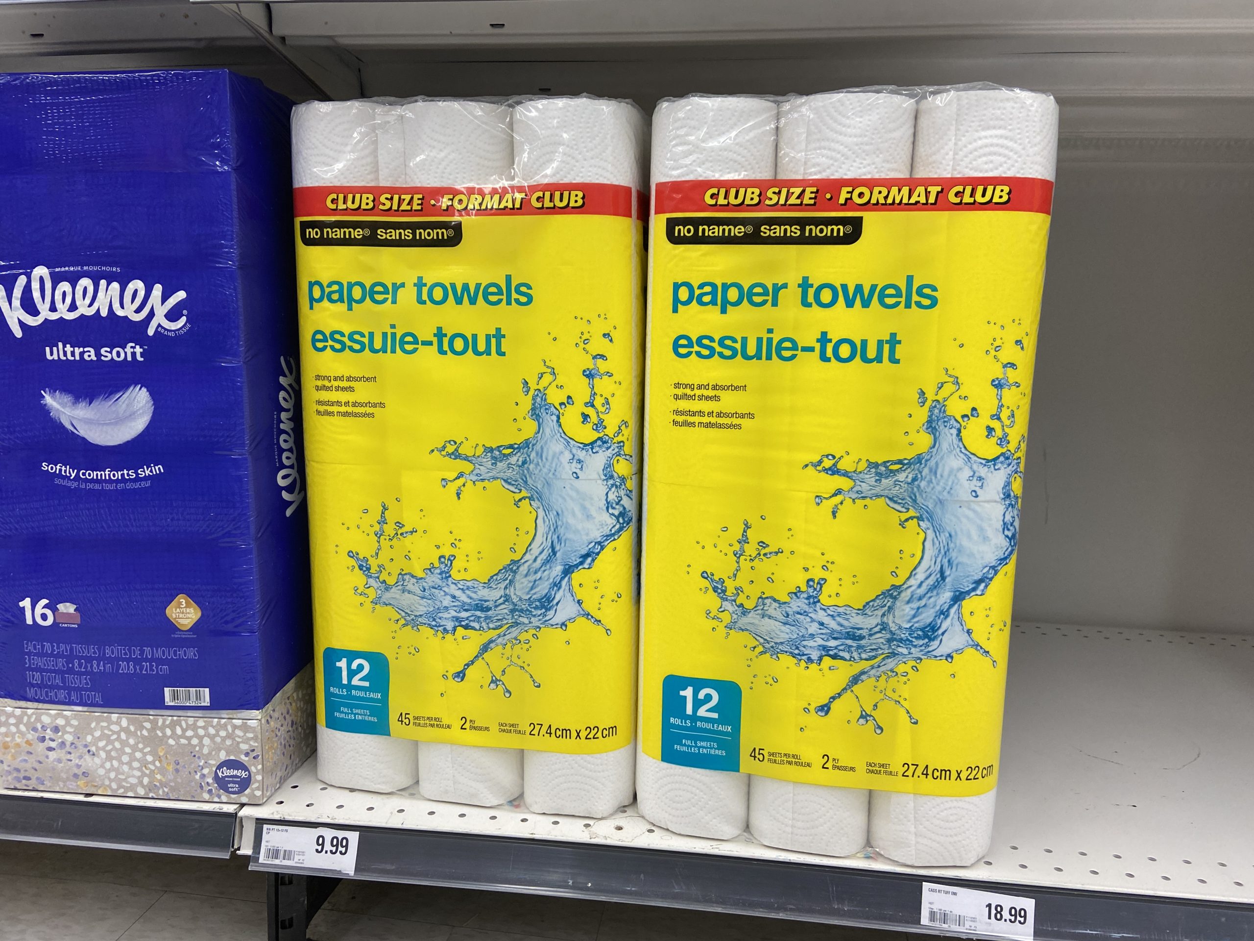
With the new store and new concept Loblaws also introduced a new brand: no name. Like the brand we know and love, no name started with stark basic packaging, black on yellow with a Helvetica font. No frills, no pictures, just like the store that sold it.
With the new product line, Loblaws was made sure to provide a good quality product at a good price. The company did not want to repeat mistakes of the past with their in house brand that offered sub-par products at a lower price than national brands. Originally, Nichol couldn’t promise that the brand would last longer than a few weeks, but after launching with incredibly successful sales numbers in the tune of millions of SKUs sold, Nichol would deem the brand a success.
A CBC News report from 1978, explaining the introduction of new generic low cost brands, including no name®
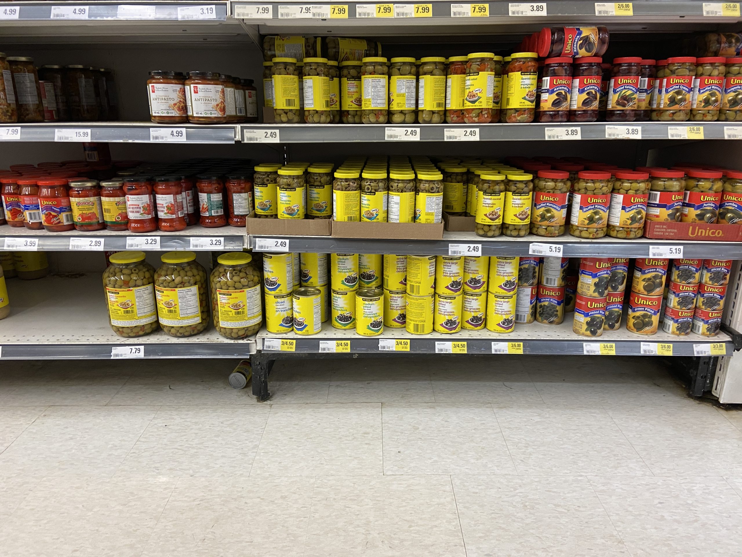
As no name® began to cement itself in the everyday lives of Canadians, Loblaws began to cement the brand into its stores. Over the years the no name® product line would grow from 16 items in 1978 to over 500 in 1982. Today no name® offers a large breadth of products, from canned corn to zoo animal fruit snacks.
no name® Today
In 2009, Loblaws would go on to rebrand their iconic line of no name® products, featuring fewer pictures and a return to stark black lettering on a yellow background. In 2018, Loblaws began updating their packaging once more, however the same iconic design remains.


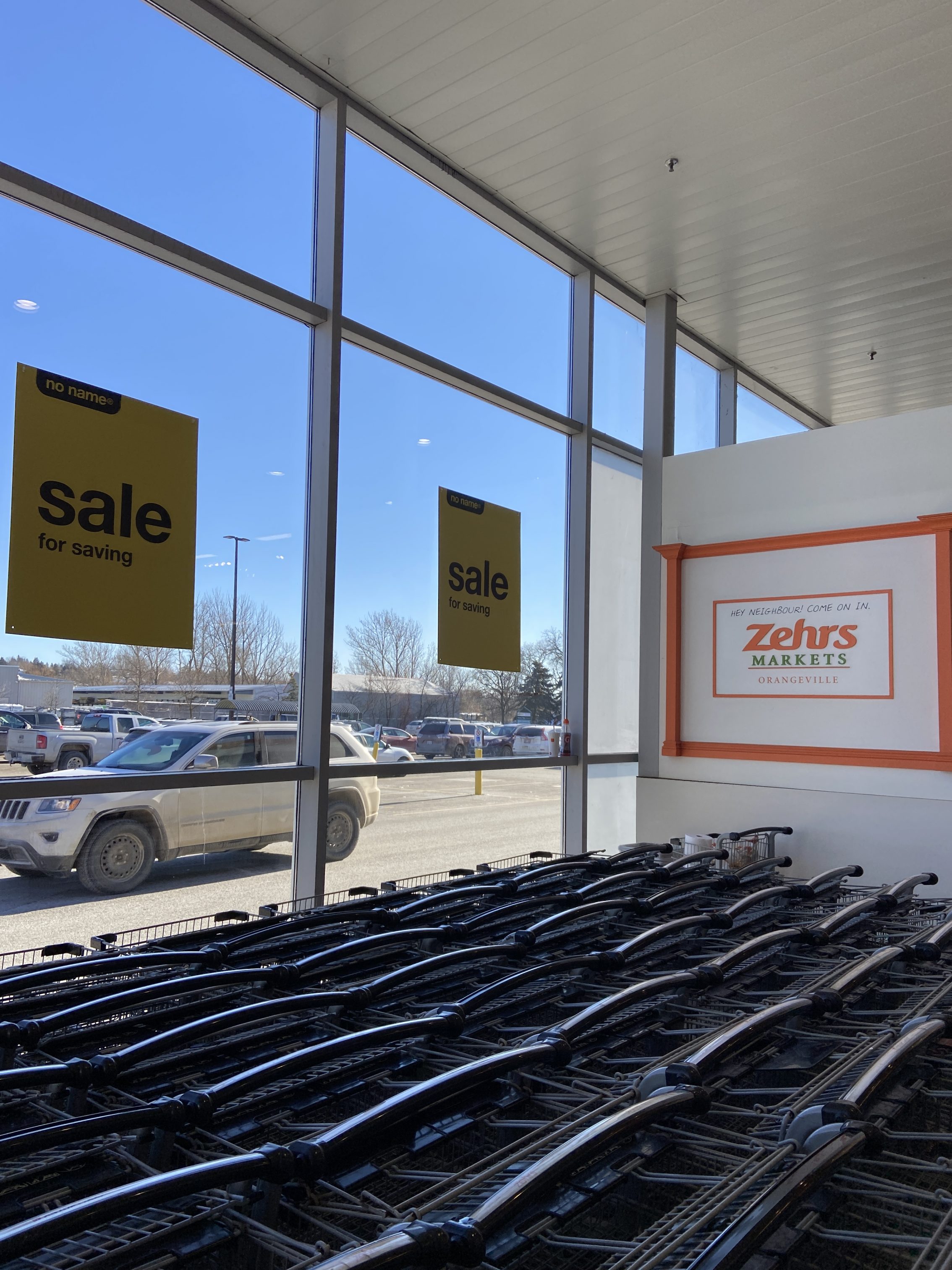
Knowing the humour behind their brand, in recent years Loblaws has begun to use the starkness of their no name® line in promotional material, including products, objects, and in-store signage branded in a very literal sense of the matter.


They have also released commercials in recent years, which certainly give you a dystopian yet humourous vibe.
Why I Love no name®
There are a lot of reasons as to why I just love the no name® brand and its products. First of all it’s the quality. I’d consider no name® (and its “higher end” counterpart President’s Choice) to be the best line of generic products in Canada, hands down. None of the other generic brands can compete on price and more importantly quality. I’m often let down by Compliments and Selection branded products from Sobeys and Metro respectively, but more often than not I’m absolutely impressed with no name®, it’s just good for goodness sakes.
But the main reason why I love no name® is its design. I’m a big believer in simplistic design choices. In my opinion, simple is better, and no name® takes this to the perfect level. When buying a generic product I don’t care for fancy packaging, all I want is a good quality product at a good price in simple packaging, and this is where no name® delivers.
So next time you’re buying a no name® product, take some time to enjoy the beauty of it. Sometimes the most mundane things in life can be the most beautiful.
Leave a Reply